Zombie Airlines
"American Airlines' fleet is old. Passenger seats shake loose and unbolt in mid-flight. Their employees are completely disgruntled... Their boarding process is painfully byzantine... The food sucks... and they're bankrupt. Sounds like a perfect branding opportunity." — Mark Kingsley

We have all had terrible experiences using poorly designed websites. It is frustrating, but what can you do? The common response is to assume that the people who created the abomination are incompetent. A less common approach is to redesign the website yourself in your free time. Surprisingly, this is an increasingly popular pastime within the design community. A good example of passionate outsider syndrome is a growing trend where designers redesign prominent websites and post their improvements online. Whether this is a noble gesture or a publicity stunt is unclear, but could this be an effective way for an outsider to change a zombie organization?
Passionate Outsider: Dustin Curtis
After a horrendous experience trying to book a flight on the American Airlines website, designer Dustin Curtis took matters into his own hands. Disguised as an act of design philanthropy, Dustin Curtis created a website mockup, posted it on his blog, and offered the redesign to American Airlines freely saying,
"Your website is abusive to your customers, it is limiting your revenue possibilities, and it is permanently destroying the brand and image of your company in the mind of every visitor. Imagine what you could do with a full, totally competent design team."
Dustin's goal wasn't to get more work, he just wanted to blow off some steam and throw a grenade at what appeared to be an easy zombie target. Dustin's blog is widely read, and his post caused a bit of an uproar within the design community. The stir was loud enough to warrant a public response from American Airlines in the form of a tweet,
"@dcurtis Thanks very much to you and everyone who has shared their thoughts about improving AA.com- we value the feedback!"
Social media to the rescue! Could Dustin's redesign bring about meaningful change for a website that so desperately needed improvement? This is where the story takes a turn for the worse.
Skilled Insider: Mr. X
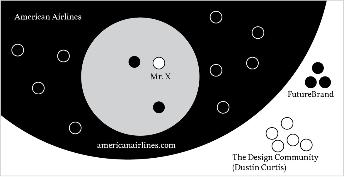
A lifeless corporate tweet was somewhat predictable, but to Dustin's surprise, one of American Airline's designers also responded with a thoughtful letter that shed light on the environment that allowed such a poor user experience to get produced. He was not a member of an "incompetent design team" but rather a skilled designer with a strong portfolio and ten years of experience. Dustin posted the letter from anonymous designer, "Mr. X" (with permission) on his blog. Mr. X explained that,
"The group running AA.com consists of at least 200 people spread out amongst many different groups, including, for example, QA, product planning, business analysis, code development, site operations, project planning, and user experience. We have a lot of people touching the site, and a lot more with their own vested interests in how the site presents its content and functionality."
The site wasn't a failure because of a lack of design skill. The breakdown happened due to the zombie culture that prevented the living humans in the organization from creating art.
From the outside it is so easy to point fingers at massive failures without realizing the nearly impossible obstacles that stifle innovation. In the words of Mr. X,
"Those of us who work in enterprise-level situations realize the momentum even a simple redesign must overcome."
The American Airlines website story doesn't end there. An hour after Mr. X's letter was published, American Airlines fired Mr. X and threatened him with legal action if he spoke to Dustin any further. Dustin was horrified by the news. He said,
"The guy clearly cared about his work and about the user experience at the company as a whole. But AA fired Mr. X because he cared. They fired him because he cared enough to reach out to a dissatisfied customer and help clear the company's name in the best way he could."
If there was any doubt about the crippling culture within American Airlines, it was confirmed by this tragic overreaction. The zombie culture at American Airlines continued to implode until two years later in 2011 when American Airlines filed for bankruptcy.
In 2013 (four years after Mr. X was fired), American Airlines rolled out a new logo and brand identity that received mostly positive reviews. It is a pleasant logo, and is part of a smart identity system. Could it be that the struggling airline has turned a corner? No, the shiny new identity wasn't done in-house. It was outsourced to the powerhouse branding firm, FutureBrand—a company so skilled at crafting identities that they could rebrand the Nazi party as girl scouts and the general public would buy thin mints from Hitler himself. The new identity amounts to nothing more than frosting on a rotten cupcake.

When you factor in a pending merger with US Airways, the brand refresh makes a little more sense. Why would you invest millions in rebranding your company if you are negotiating a merger which would result in the evaporation of your brand into a new identity? The zombies realize that the perceived value of the company will increase if they look like a more legitimate acquisition prospect. It isn't about creating a strong brand, it is about looking like a strong brand. It isn't an investment in design brought about by a cultural change within American Airlines. It is an investment in branding as a shortcut to legitimacy. The rebranding goes hand-in-hand with claims of profitability that stem from an equally sugary reading of their financial status. The new logo is just lipstick on a zombie.
Let's take a step back and see what this looks like from a distance. The design community rightly points out an object that is damaging to humanity and shows how the problem could be corrected. The organization contains a few humans that care deeply about the issue and have the skill to fix it. They work daily to improve the system from within, enduring the brain sucking culture that hampers their efforts. When the artist publicly defends their work, the zombies within the organization are alerted to the presence of the living being in their midst. The artist is quickly disemboweled and his corpse is expelled from the organization. The organization proceeds as if nothing has happened, limping along absorbing the blows of lost revenue and even bankruptcy. When things get bad, and seeing a chance at acquisition, the zombies turn not to the internal artists but to outside conmen. The website never gets fixed, the artist loses his job, and the company never addresses its real issues, and they proceed to poison humanity for years and years.

The problem with the current state of affairs is not a shortage of designers. The problem is deeper than websites that deliver poor user experiences. The problem can't be solved by ranting on your blog. It can't be smoothed over with corporate Twitter accounts and lifeless tweets. It can't be whitewashed with a million dollar rebranding campaign. This is what the zombie apocalypse looks like. The plague has consumed the system making it impossible for integrity to prevail.
Outsiders lack the ability to invoke change, despite their passion. Insiders, despite their talent, fail to change institutions from within. How do we resurrect a zombie culture that seems so incapable of change? Next we will go back in time, to the origins of human flight to study the artists who invented the airplane. Could the cure for the zombie apocalypse be an overlooked lesson of the past?