Boston: The Marathon Data Project
Role: Data engineering, design, development & writing
When: 2017–2020
Results: a four-part study, an interactive tool, and an open dataset
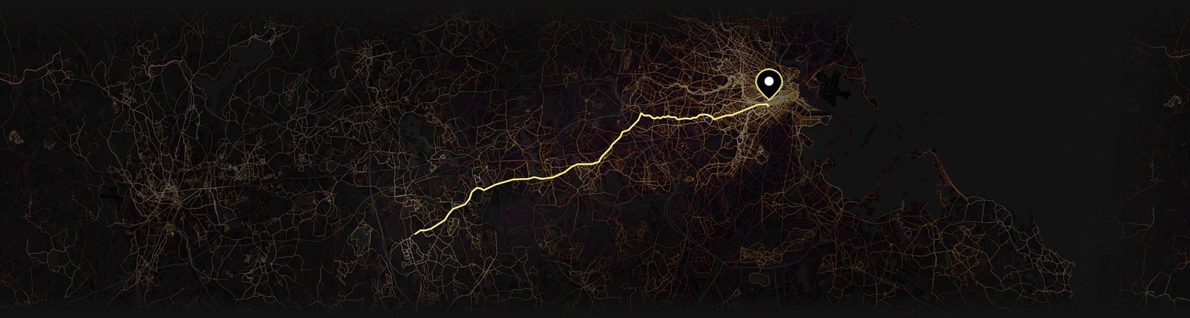
Finding the story hidden in the data
I’m a designer, but I’m also a runner — and a Boston qualifier. Every time I’ve lined up at the start line I’ve been struck by the diversity of people around me, and it’s always been the thousands of runners behind the winners that interest me more than the podium. So I did what I do when something grabs me: I went looking for the story hidden in the data.
To help me answer my questions, I assembled 121 years of Boston Marathon results and turned the work into a four-part study that uses data to solve mysteries around qualifying for the big race. I also designed an interactive tool that lets anyone explore the numbers themselves, and an open dataset for researchers who want to run their own analysis.
Four hard questions, answered with data
Part 1 — How hard is it really to get into Boston?
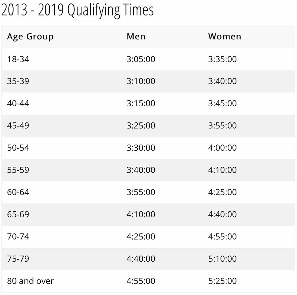
Boston caps the field around 30,000, with more than 20% reserved for charity and special invitations — leaving roughly 23,000 spots for runners who hit the qualifying standard. But meeting the standard isn’t enough. So many people qualify that the B.A.A. has to turn away runners who already earned their time: more than 7,000 rejected in 2019 — nearly 1 in 4. The field stays remarkably balanced (a consistent 45% women / 55% men), and the data exposes a quirk worth gaming: because runners are bracketed into five-year age groups, being on the young edge of a bracket is a real advantage. Read Part 1 →
Part 2 — Why is the Boston Marathon so slow?
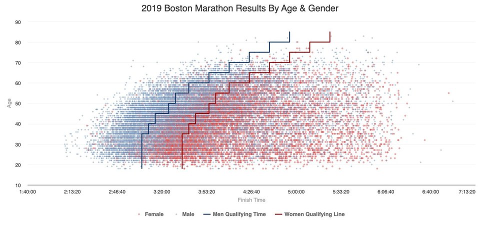
Here’s the paradox that became the spine of the whole project: every single runner beat a tough qualifying time just to get in — yet on race day only about 29% run that time again. I split the field by age and gender and overlaid the qualifying standards as stepped lines. Every dot to the right of the line is a runner who finished slower than the time that earned their spot — and that’s most of the field. I tested the obvious culprit, weather, and found something counterintuitive: cold, wet years produced better times than perfect ones. The bigger factor isn’t the weather, it’s the fact that for most people, Boston is a celebration, not a time trial. Read Part 2 →
Part 3 — How has the race changed in 121 years?
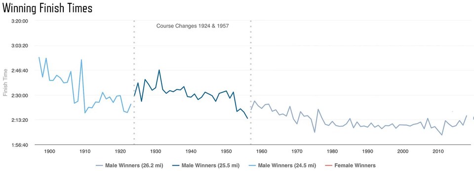
Expanding the dataset to the full 1897–2018 span tells a story of transformation. The race grew from ~30 finishers to more than 30,000 — all men until 1972, now including 200,000+ women across its history. The winners got steadily faster, then plateaued (the chart’s dotted lines mark the 1924 and 1957 course changes that nudged the distance). The real surprise is in the averages: typical finish times have actually gotten slower since the mid-1970s — not because runners declined, but because the race opened its doors and stopped being an elite men’s club. Evolution, not decline. Read Part 3 →
Part 4 — Is it getting harder to get in — and are we getting faster?
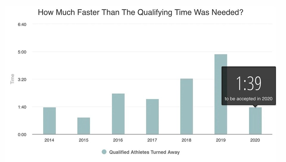
Getting in keeps getting harder. The “cutoff” — how much faster than the standard you actually had to run to be accepted — climbed to a brutal 4:52 in 2019. The B.A.A. tightened every standard by five minutes for 2020, which reset the cutoff to 1:39, but still turned away another 3,161 qualified runners. The tempting conclusion is that runners are getting faster — but the data says no. Despite Kipchoge’s sub-two-hour run, average finishers aren’t improving. The race isn’t getting faster; it’s getting more popular, which only makes a spot there more meaningful. Read Part 4 →
A tool anyone can explore
This study answered the questions I thought to ask but still leaves many more unanswered. To make it easier for anyone to explore the data I built the Boston Marathon Data Project site — an interactive tool with seven sections (Course, Participation, Demographics, Qualifying, Results, Performance) and a placement calculator where any runner can enter a finish time and see where they’d have placed in a given year. The point was to hand the data to the reader and let them chase their own curiosity.
An open dataset for researchers
Underneath both is the tedious data-cleaning I performed to arrive at consistent, year-by-year results back to 1897. I published the entire dataset on GitHub, warts and all (the earliest years are winners-only; 2013 splits around the bombing), so other runners and analysts can build on it. I make no claims of ownership — it’s a resource for the whole running community.
Strip away my running-nerd enthusiasm and this is a case study about a specific skill set: using data to answer hard questions, wrangling messy real-world records into something trustworthy, and designing the visualizations and tools that turn 121 years of numbers into a story a person can actually feel. It’s the same job I do for products: uncover the value that actually resonates with people. This is why I believe the hard UX problems are universal whether you design for runners or farmers. Be sure to look at my other fitness-tech work if you are curious about how my design thinking is improving the experience of athletes.
Go deeper: